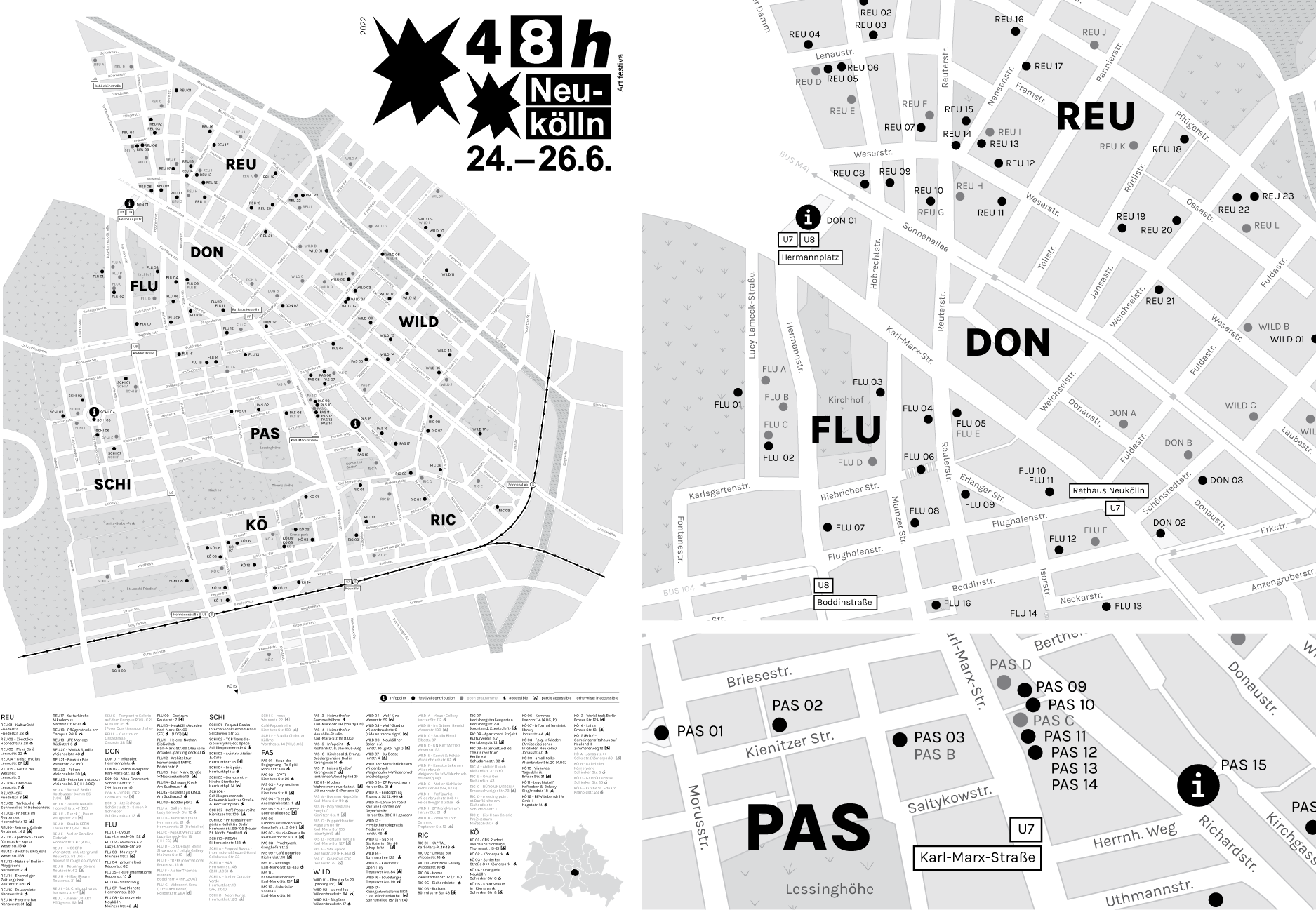
In 2022, I designed the map and programme layout for 48 Stunden Neukölln, Berlin’s largest independent art festival. I developed both print and digital versions in German and English. The front page featured a comprehensive map showing all 180 event locations. I enhanced the map’s clarity by increasing contrast and adjusting grey tones, making festival locations stand out while keeping all information easily readable.
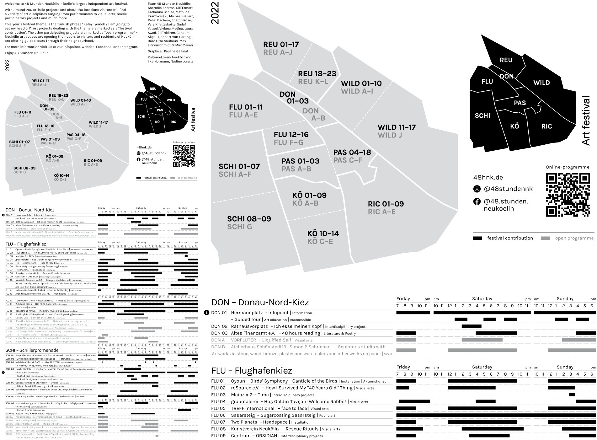
The second page included detailed festival information, a complete programme schedule, and two overview maps for improved navigation. The festival map was segmented by neighbourhoods, which were also highlighted on a small black overview map accompanying the schedule. To enhance navigation and understanding, I and organized the art events accordingly in the page layout and divided a second map into smaller sections, particularly where neighborhoods were spread out.