Infographics

, ,

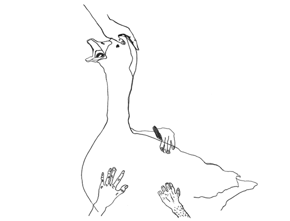
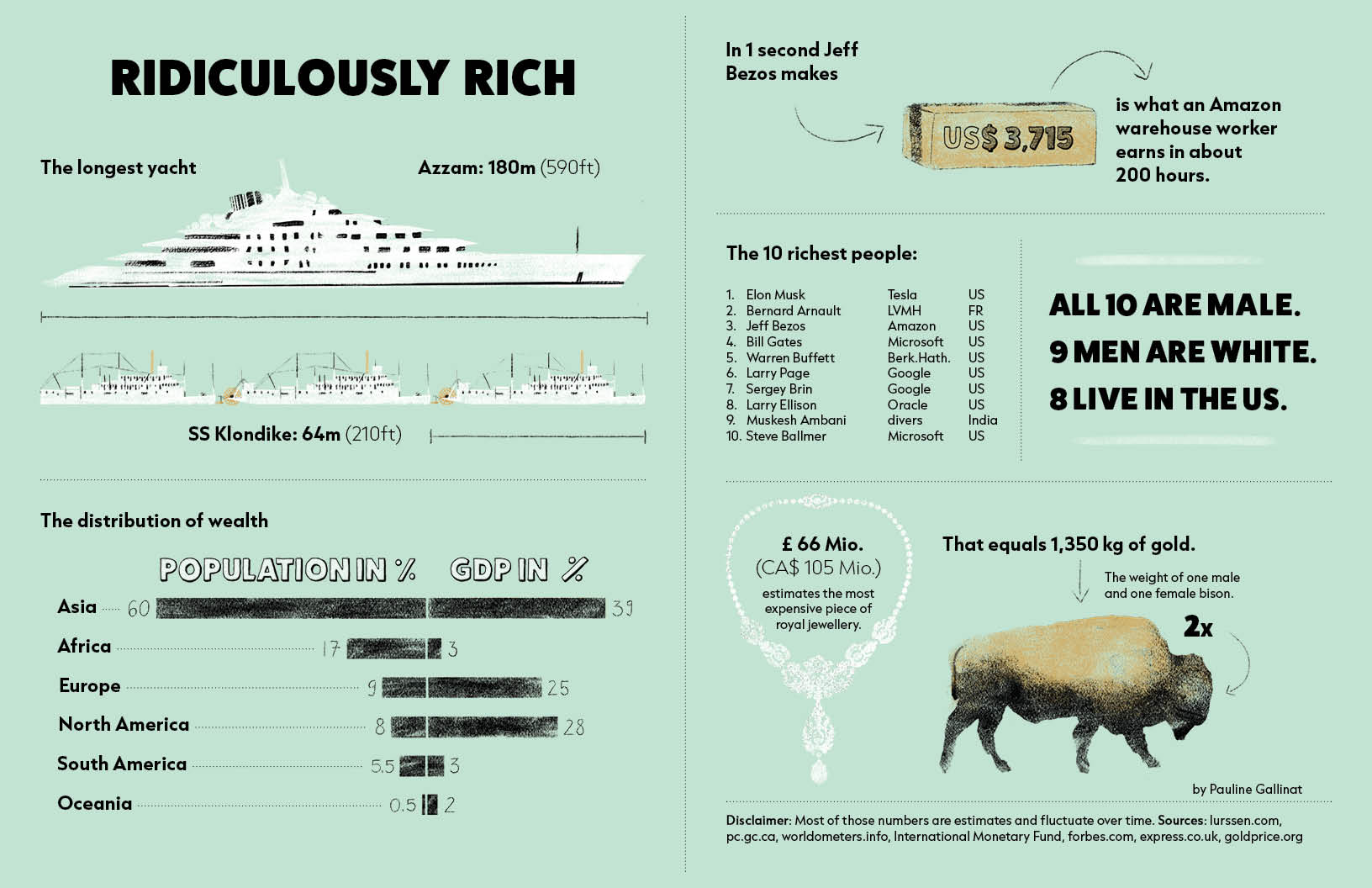
Infographic: Ridiculously Rich, The longest yacht fits almost three sternwheelers; bar chart: The distribution of wealth – Asia population 60%, GDP 39%, Africa population 17%, GDP 3 %, Europe population 9 %, GDP 25%, North America population 8 %, GDP 28%, South America population 5.5 %, GDP 3%, Oceania population 0.5%, GDP 2%; In one second Jeff Bezos makes USD 3715, that is what an Amazon warehouse worker earns in about 200 hours; List of the ten richest people – all 10 are male, 9 men are white, 8 live in the US; 66 Mio. GBP estimates the most expensive piece of royal jewellery, that equals 1350 kg of gold, the weight of one male and one female bison; Disclaimer: Most of those numbers are estimates and fluctuate over time.

This infographic illustrates selected examples of wealth distribution, providing an overview of controversial topics such as global wealth inequality, luxury, class, gender, and colonial structures.

Created for a zine published by YILCO (Yukon Illustration Coalition), the infographic is tailored specifically to the Yukon audience. The hand-drawn illustrations add a unique, personal touch to the design.
World Wide Wittenberg - Map with a chart on each continent showing the population in relation to Christian population and within the Protestant population: North America population 631 million, 77% Christian, 17% Protestant, South America population 362 million, 92% Christian, 10% Protestant, Europe population 747 million, 78% Christian, 12% Protestant, Africa population 1.16 billion, 49% Christian, 19% Protestant, Asia population 4.4 billion, 9% Christian, 2% Protestant, Oceania population 38 million, 73% Christian, 34% Protestant,

500 Years After Martin Luther’s Reformation: This map shows the global distribution of Christianity, showing each continent’s total population (outer circle), the percentage of Christians (light blue circle), and the proportion of Protestants (dark blue circle) within the Christian community. Published in 2016.

 
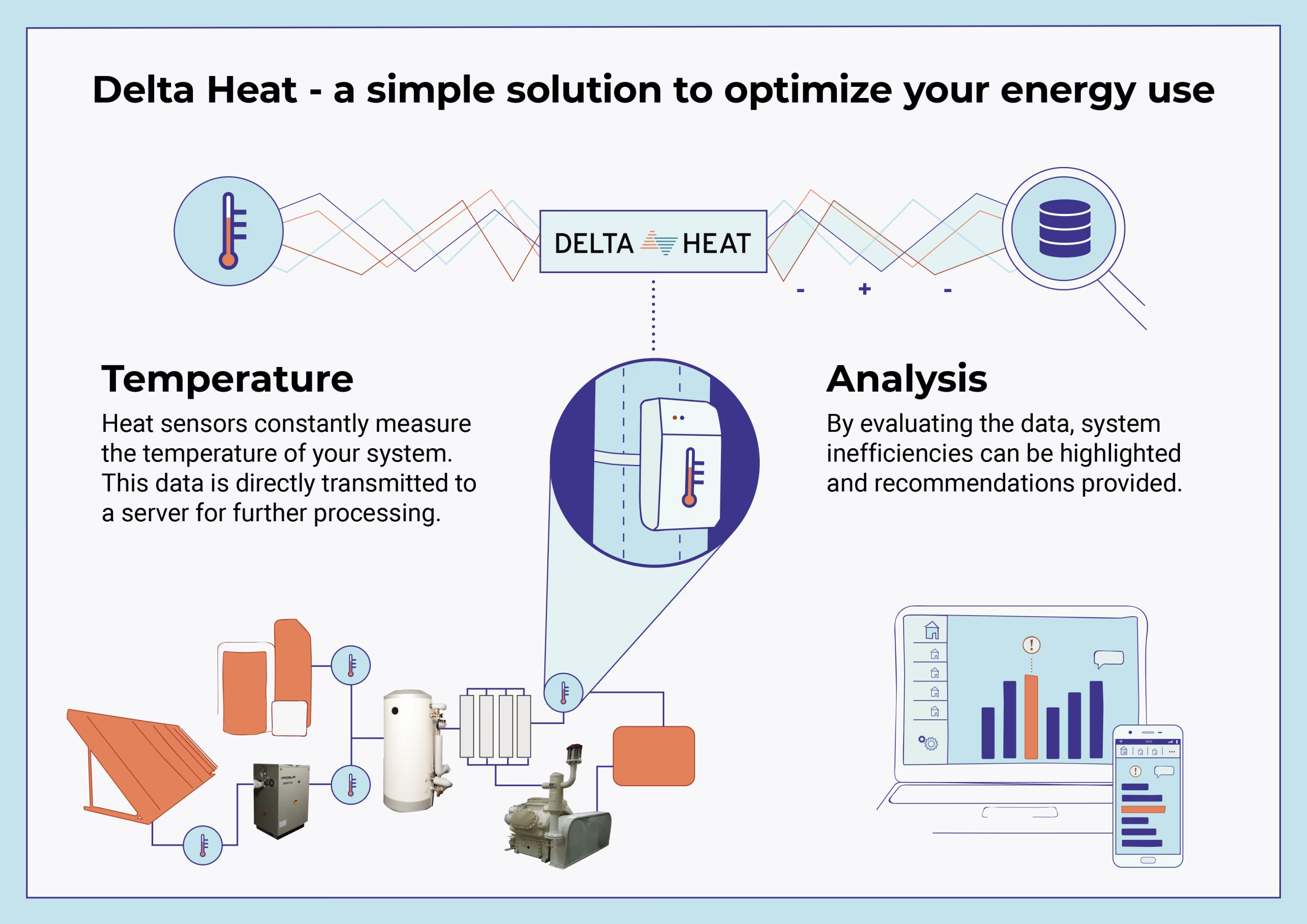
Infographic showing delta heat's process of measuring and analyzing temperature data

Delta Heat is a Berlin-based company that specializes in heating system efficiency. Here, I outline Delta Heat’s process of tracking and analyzing thermal data within a heating system to optimize energy efficiency. I also designed the company’s logo and created animated vector graphics to visually enhance the process.
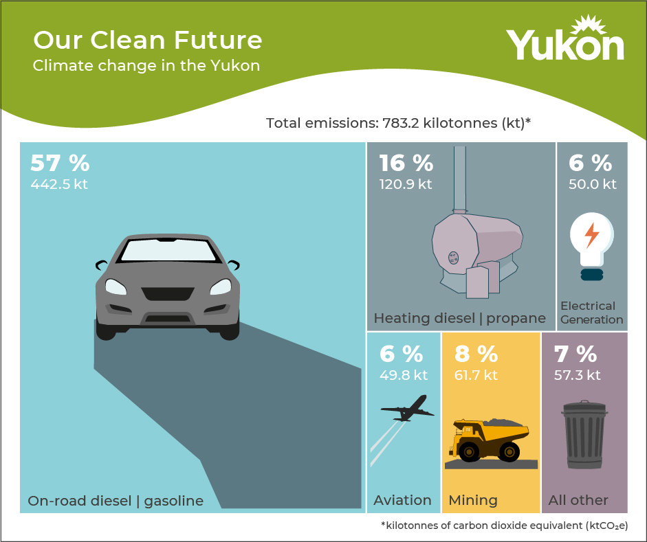
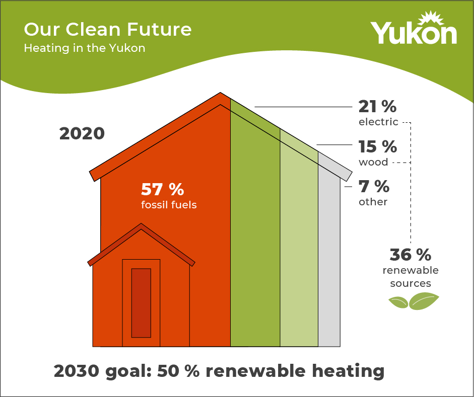
Infographic, Climate Change Yukon, emissions by category, on-road 57%, heating 16%, mining 8%, electrical generation 6%, aviation 6%, other 7% Infographic, Heating in the Yukon 2020, 57% fossil fuels, 36% renewable (incl. 21% electric, 15% wood), 7% other, 2030 goal: 50% renewable heating
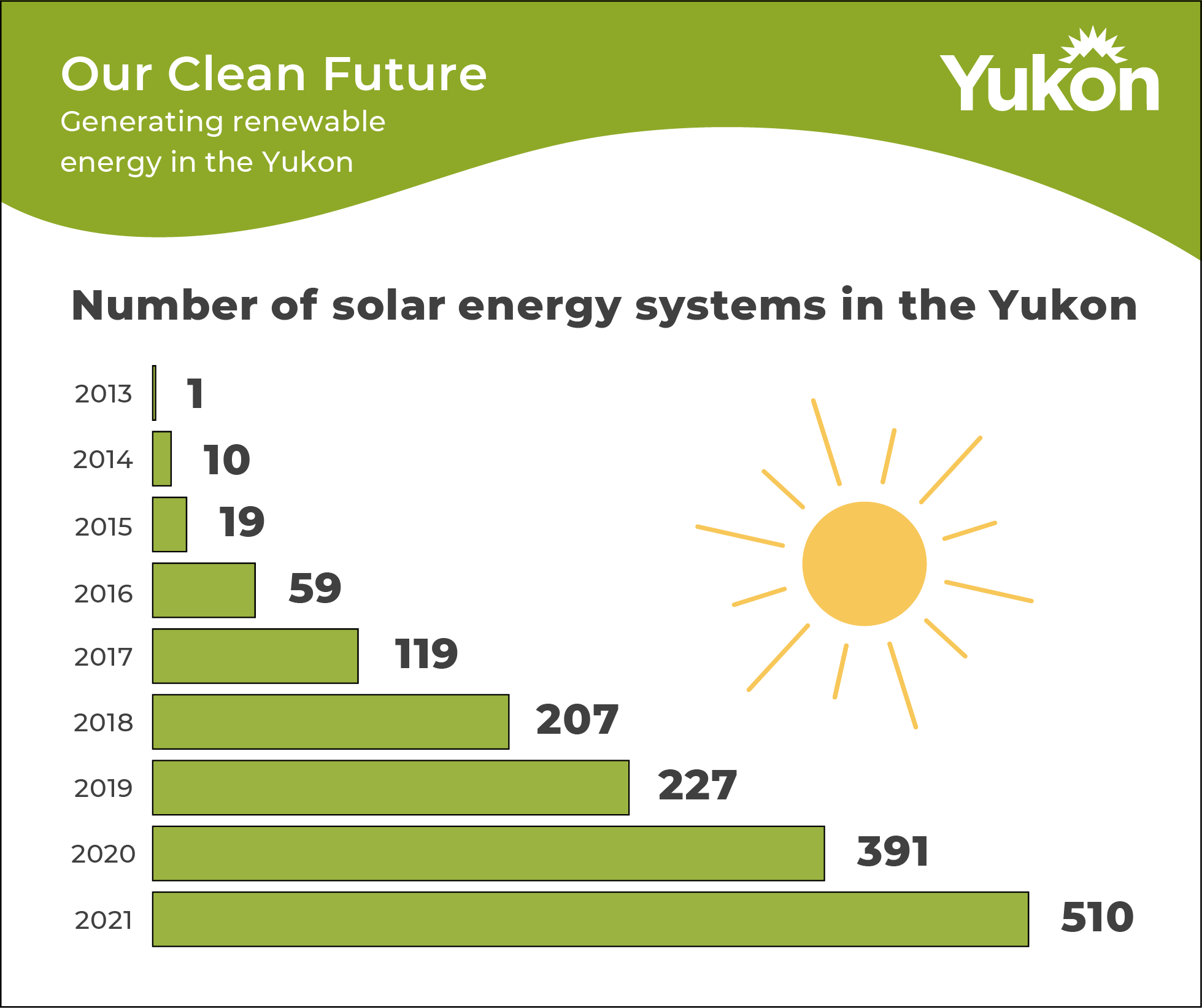
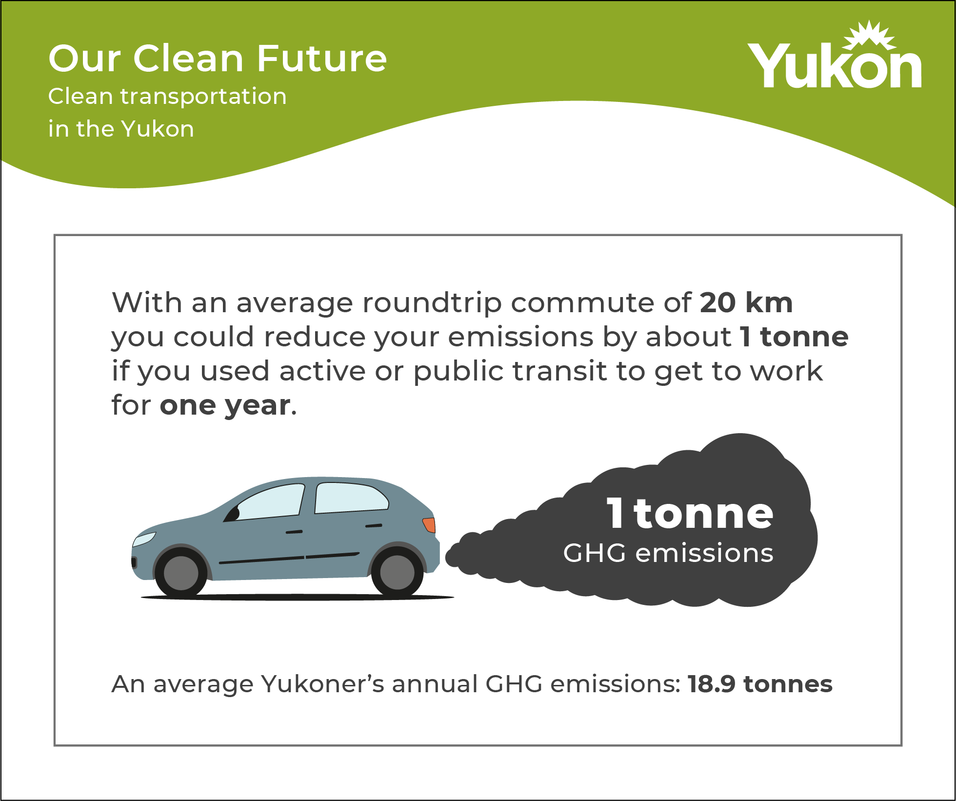
  Bar chart - Number of solar enery systems in the Yukon: 2013 - 1, 20214 - 10, 2015 - 19, 2016 - 59, 2017 - 119, 2018 - 207, 2019 - 227, 2020 - 391, 2021 - 510; Illustration & text, transportation in Yukon, With an average roundtrip commute of 20km you could reduce your emissions by about 1 tonne if you used active or public transit to get to work for one year, avarage Yukoner's annual GHG emmissions: 18.9 tonnes 

I created these social media infographics for the Our Clean Future Campaign, showcasing key data and trends in areas like fossil fuel emissions, heating, solar power, and transportation. These visuals emphasize the Yukon’s sustainability goals and its commitment to a cleaner, greener future.

Client: Department of Environment – Yukon Government

Trend for ebook market in Germany between 2011 and 2014  Animation listing the cities with the most bookshops per capita in Germany
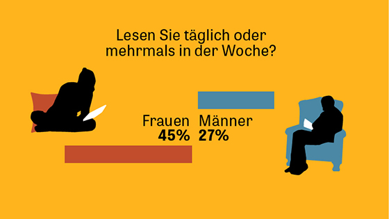
Do you read daily or multiple times a week?
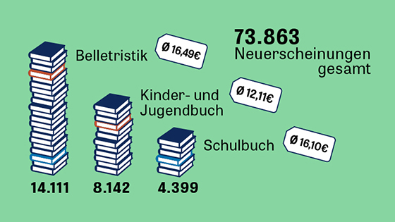
Women 45%, Men 27%  Infographic on book releases in Germany in 2015

With these graphics and animations I visualized data about the German book market, published around the time of the Frankfurt Book Fair 2015.

Graphic 1: Market share of e-book sales from 2011 to 2014.
Graphic 2: Cities with the highest number of bookstores per capita.
Graphic 3: Reading habits — 45% of women and 27% of men read daily or multiple times a week.
Graphic 4: Comparison of all book releases and the three largest book categories.

Client: ZEIT ONLINE
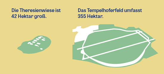
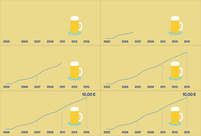
Infographic compares Theresienwiese (Oktoberfest) with Berlins Tempelhofer Feld  Graphic showing trend of beer price, 2002 6.30€, 2015 10€
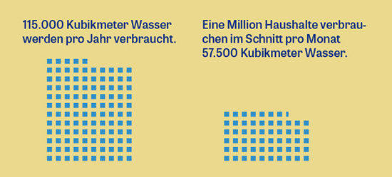
112000 prevented theft of beer glasses   Comparison on water consumption

In these infographics I show and compare numbers about the Octoberfest, that I all designed in a classic vector-style illustration, with one infographic featuring animation.

Graphic 1: A comparison of Theresienwiese (Oktoberfest grounds) and Tempelhofer Feld, Berlin’s largest city park.
Graphic 2: The trend in beer prices at Oktoberfest, rising from €6.30 in 2002 to €10 in 2015.
Graphic 3: 112,000 beer glasses detected before being stolen at Oktoberfest.
Graphic 4: A comparison of Oktoberfest’s water consumption with the average water consumption by 1 million households per month.

Client: ZEIT ONLINE

Further Projects